
About the Project
Tools & Skills
Redesigning Groupon’s unsubscribe experience to remove dark patterns and build user trust.
This project was part of my UX Writing course at the University of Washington. I analyzed and rewrote a real-world interface that used dark patterns to make unsubscribing difficult. My goal was to simplify the experience, give users control, and promote ethical design through clear UX writing.
🖊 UX Writing | 🎨 Figma | 🧭 Ethical Design | 🔍 Content Strategy
The Challange
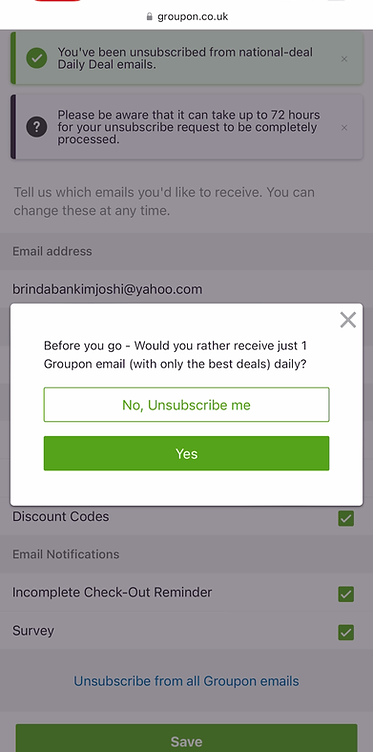
Groupon’s unsubscribe page used a “Roach Motel” dark pattern - easy to join, hard to leave.
-
Only unsubscribed from a small category (“Daily Deals”), not all emails.
-
Used persuasive pop-ups (“Are you sure you want to leave?”).
-
Misleading visual hierarchy – the “Stay Subscribed” button was dominant
The UX Rewrite
A. Unsubscribe Page - Before & After
BEFORE -
-
Confusing categories
-
Small “Unsubscribe from all” link
-
Hidden hierarchy

AFTER -
-
Clean checkboxes for full or partial opt-out
-
Centralized “Unsubscribe from all emails” button
-
Simple, transparent structure

B. Pop-up Prompt – Before & After
BEFORE -
-
Biased CTA styling
-
“Stay” button emphasized
-
Manipulative tone
Proposed Solutions & Recommendations
AFTER -
-
Neutral CTAs with equal weight
-
Both options visually equal
-
Transparent, respectful language

My UX Writing Approach
I focused on writing that’s clear, transparent, and respectful.
Clarity over cleverness:
"You’ve successfully unsubscribed from Groupon’s Daily Deals."
User control:
Added clear checkbox options for categories.
No manipulation:
Equal styling for both CTAs lets users make genuine choices.
Design Reflections
This project helped me think beyond “just fixing text.” It made me question how businesses balance engagement and ethics.
I learned that transparent UX writing can strengthen long-term user relationships even if it means short-term losses.
I’d also like to test ideas like a “Pause Emails” option to give users flexibility without trickery.
Takeaways
-
Designing for trust builds credibility over conversions.
-
Ethical UX writing is about empowering users.
-
Simplicity = clarity = confidence.